Branding
2023
M Leuven
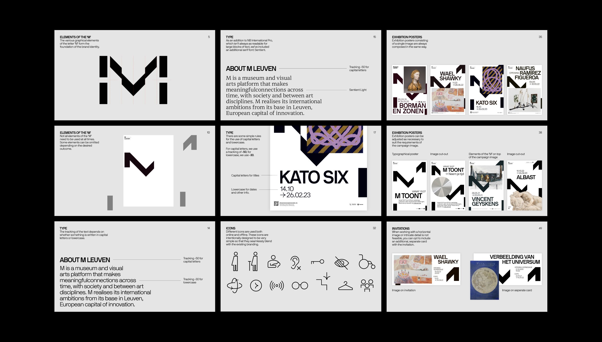
I've been an in-house designer at M Leuven for four years, initially joining the communication team when the museum introduced a new identity. In this time, I've worked closely with the team to enhance and expand the identity in various applications. Recently, I updated the brand manual to match our evolving needs.
Type
A significant update involved introducing a new font. The initial brand identity exclusively featured a single sans-serif font. Consequently, it was a sensible choice to incorporate an additional serif font suitable for longer text passages and printed materials.
Colour
Another significant update was the introduction of color. The brand's original color palette primarily comprised white, black, and gray tones. Recognizing that these colors might not be appealing to children, I developed an entirely new color palette for all applications targeting a child audience.
Open M
It is essential to establish a visual distinction between the various projects within the museum. Open M is one such project that required a new visual style. Open M is an initiative that offers visual artists the opportunity to showcase their work in the museum's galleries. The process begins with an open call, welcoming artists from all disciplines to submit their work. In each edition, a guest curator selects works from the submissions, resulting in a group exhibition.
I drew inspiration from the concept of an open letter 'M,' taking it quite literally. I worked with the outlines of the letter, leaving ample white space, much like a blank canvas. It was important to me that the visuals for the open call remained as neutral as possible, so artists from all fields would feel encouraged to apply. After the selection of artworks was completed, I designed new visuals for the exhibition. I used the chosen works to fill in the outlines. The outcome is a visual style and concept that is timeless and seamlessly integrates with the museum's overall branding.


